
I have a good friend and client, Nan, who is often on the receiving end of some of my “pet-peeve rants.” One of the ones that she has often helped talk me down from is bad kerning. I hate bad kerning. A lot. Almost as much as bad driving and Willy Nelson. But I’ve preached the kerning thing enough that I think I’ve rubbed off on Nan. She’s now starting to get annoyed with bad kerning too. And this is a good thing. Kerning is that important.
Kerning is a term I learned when I got to my Lettering and Layout class in my sophomore year at college. It’s a pretty easy to understand design concept, and a very important one when working with any kind of text. Basically, kerning is the amount of space between letters.
Kerning is one of those things that when done properly, you don’t notice. The text is easy to read, it’s easy on the eyes, and it's comfortable. It’s when the kerning is done poorly that suddenly the text is awkward and sloppy. It can even take on a totally new meaning.
To explain this better, I think it's easier to show you examples. (I always like visual examples!)

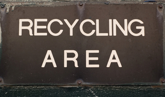


Can you see it? How the spacing is off? Maybe on York and Travel you have to look for it a bit more, but it’s there. And it’s uncomfortable. And the part about it changing the meaning altogether? Check these unfortunate signs out:


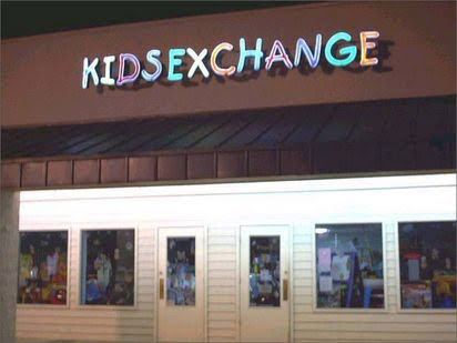
Sadly, these are real. And there were even worse ones when I searched for examples. It’s a shame, because it’s an easy design fix and should have been caught long before being mounted on a sign.
Luckily, most software today, even ones not specifically for design, have some sort of kerning option. In the design world, standards like Adobe products have easy kerning options and shortcuts built in to make it a quick and simple fix. Other more cumbersome programs like Word and Publisher have ways to do this if you start digging around in the formatting and fonts tabs.
So, what IS good kerning? It’s when the letters fit together with an even, comfortable space around them. The trick is that with characters that have round shapes and diagonal lines, they aren’t going to automatically fit and look good. So it’s the designer’s job to fix that. In my example, I’ve typed a common word, ACTIVE. In the first frame, it’s shown exactly how it was typed. In the second, I’ve adjusted for the slant of the A, the curve of the C, and the slant of the V. Can you see the difference?
 |  |

So for Nan, and any other friends I’ve made an impact on…good! Maybe if enough of us not only recognize bad kerning, but strive to fix it, the world might be a more beautiful place!
 RSS Feed