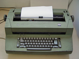
But guess what? If you look at a professional publication, a typesetter doesn’t follow typewriter rules. They don't apply. And really, none of us should follow them either. Typesetting was impossible to duplicate on a typewriter, so adjustments had to be made. But they need to be forgotten.
Luckily, computers can typeset like a pro! There are a few tricks I’d like to share that will make what you type on your computer look more professional.
1. There is only 1 space after a period. One. There is one space after an question mark and exclamation mark as well! If the sentence is ending, there is one space before the next one starts. One. Got it?
2. Italics should be used for any words that need special attention, even titles. Not underlines. Italics. There really is no use for underlines. MLA and AP guidelines have switched to using italics for all cites, as well as APA. There is always the exception if you’re writing a paper and your professor is old-school and demands it. Do it his way, even though he’s wrong.
3. There are settings called Smart Quotes in word processing programs. A Smart Quote or Typographer’s Quote is a quotation mark or an apostrophe that bends or slants, depending on the font. If you have straight lines showing up, you are using a measurement mark. Two parallel lines are an inch measurement mark. One straight line is a foot mark. To find these settings, look in your character or type options, or possibly your auto correct options. They vary from program to program, but almost all have them.
5. Do not put double returns after paragraphs. There are settings within the Paragraph tabs of most programs that can be changed to include extra space after a paragraph, if you’d like space between them. The amount of space doesn’t need to be huge, but enough that you can see the break in text. If you double return, you risk the chance of having extra space at the tops of new pages and columns where things don’t wrap properly, especially in long documents where the text flows on and on. It’s easy to miss. By including it in your paragraph setting reduces that risk. Sadly, I don’t have that option in my Blog settings, so double returns it is!
6. Don’t use the space bar to add space between columns and indents. Back when we were on a typewriter, and even early computer programs, we were stuck with fonts that had the same spacing for all letters, numbers and even spaces. So even though there was a Tab key, we could just space forward 3 or 4 or 20 spaces on each row and everything would line up. With the thousands of beautiful fonts out there, a HUGE majority of them proportionally spaced, this method doesn’t work. It’s especially bad when you send the file to someone else, and they don’t have the correct font loaded.


 RSS Feed