
I had a client once who hired me to design a brochure for a public utility. The brochure was going to be available to the public to explain some changes in policy, so it needed to be clear and concise. I made it the correct size, used colors that complimented their logo, made the maps and diagrams easy to understand and accurate. I read through it carefully, correcting their grammar and spelling errors (yes, there were some). I was happy with the results.
I went to a meeting with the client and we sat down to discuss the project to make sure everything was in place before printing. Everyone was very happy, about to sign off on the deal when the head of the department came in for a quick look. He'd been left out of the loop for previous revisions, so he wanted to put his opinion in for the last round. He was pleased with our product, and how easy it was to understand, how professional it looked.
But…there was white space. What was with all that white space? He thought since he would be purchasing each piece of paper, it should be completely filled up with print. We needed to make the fonts bigger and make the margins wider and fill up all that white space. And he would not approve it until I redesigned it his way. Needless to say, the end product does not hold a spot in my portfolio. It was crowded and ugly and hard to read.
What non-designers need to know is that there are basic design elements that all creative professionals use, and negative space is one of them. That blank spot creates balance on page and screen. If the design space is not in balance, it can look heavy and complicated. It can make you feel uncomfortable and overwhelmed. It's hard on your eyes to read. That isn't always the look and feel a designer is aiming for.

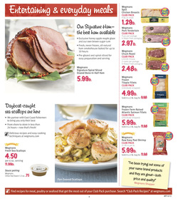
This sale circular comes in my Sunday paper on a regular basis. This type of advertising, where there is text and pictures crammed into every possible space, creates a feeling of chaos, and it feels unrefined and brash. It's funny…their store feels the same way. This crazy, unprofessional feel is part of their brand. I have to think, though, that many businesses don't want this.
This one shows up regularly as well, from one of my favorite places! The use of white space around the food items and the spacing between the text creates a much more comfortable feel to the circular, as well as gives you expectations about the cleanliness and professionalism of the store. It's easy to read. It's well organized. It's more balanced.
Let's look at websites. shall we? This one is for a bridal gown store. I found this by searching for "ugly websites." It was the first one that popped up. I have to say, even if this store had the best gowns in town, I would never, ever think to go there based on this website. And it's ugly for many reasons, but in today we're blogging about space, so notice that there isn't any on this website? Every possible spot on the screen has images or text. (Note: reference my earlier blog about using too many fonts). There is no way to navigate this. My eyes are confused as to what I'm looking at. There's no flow. No balance.
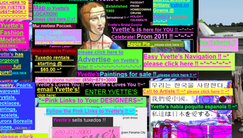
Just down the road is another bridal store. If I were searching for a dress and typed it into my search engine, this site would come up along with the last one. They're just a few miles away on the map. Their use of white space around the text on their website makes it easy on the eyes. The white top and bottom balance out the large photo in the middle. All in all, it's easy to read and screams elegance and professionalism. I would expect the store and their products to have the same beautiful feel.

This is NOT my real business card (thankfully) but it IS an example of how not to design a business card. There is such thing as putting TOO much information on a card. In fact, I think it is one of the biggest mistakes people make when designing a business card. The lack of empty space makes it feel heavy and like I'm desperate to make sure you know everything about me. I will never hand you this card over coffee.
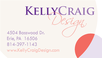
Ok, this isn't my real card either. However, this is the same card with only the important stuff on it. The rest is space. Nice, comfortable space! The bulleted list could always be moved to the back, if I really felt it necessary. I could keep the slogan, but the uncluttered feeling without that extra text is more valuable to me that a slogan that may or may not drum up any new business or make me memorable.
In a future post, I'll visit negative space as an element of a logo. There are some really fantastic logos out there where the void IS part of the logo. But that is a whole blog entry in itself!
In the meantime, take a look at your marketing materials, your cards and brochures, your website…how do they look? Are they crowded or comfortable? Are they balanced? Are they easy to navigate? It might be time to add a little negativity! Cheers~K
In the meantime, take a look at your marketing materials, your cards and brochures, your website…how do they look? Are they crowded or comfortable? Are they balanced? Are they easy to navigate? It might be time to add a little negativity! Cheers~K
 RSS Feed