
A couple of weeks ago, I posted about the value of negative space in design and layout. I'd like to expand that idea and look at creative ways designers have used that space as part of a logo.
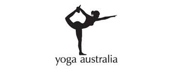
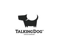
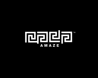
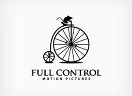
Some of the best logos in use today are as good as they are, equally because of what is present, and what is not, in their design. The designer has used this space as an optical illusion, yet so clever and simple! I wish I could say I am the artist behind these, but sadly, they're just my inspiration. I want to share some of my favorites:
Some of the best logos in use today are as good as they are, equally because of what is present, and what is not, in their design. The designer has used this space as an optical illusion, yet so clever and simple! I wish I could say I am the artist behind these, but sadly, they're just my inspiration. I want to share some of my favorites:


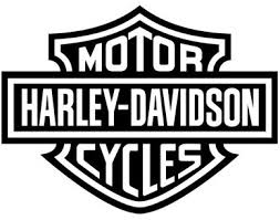
The are lots of other great logos out there that also use negative space, but not as a clever addition to the design, but just as a nice balance to the layout. They're good logos!


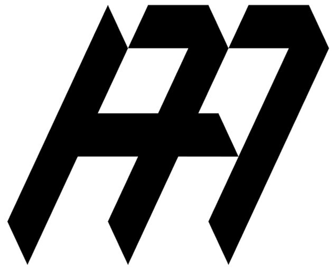
And then there are ones that miss the mark. Some are logos that ARE an optical illusion, but not intentionally so, with the negative space creating a picture that really isn't what that business is selling. Others use space in such a way that it is either overpowering the design with too much space and making it seem lifeless and weak, or not enough space and giving us the feeling of being overly bold and smothering. None of these are a good way to market a business:


So, what's the point? The point is that knowing how to use dark and light, printed and non-printed space, and balance, makes for good design! And a GOOD logo design makes the difference in how your business is perceived!
 RSS Feed