
Have you ever heard of KISS? Not the flamboyant rock band of the 70s, but the "Keep It Simple, Stupid" principle. It was first developed in the 1960s by the U.S. Navy for systems design, but it applies to many other processes, especially graphic design. When designing practically anything, it can be tempting to try to impress others with a wide array of fonts. Fonts can be fun, creative, dramatic, sensible. But just because your computer has 367 fonts loaded on it, doesn't mean you need to include them all.
So, when do you call it quits? Unless the type itself is an art piece, the fewer the better! A good design can happen with one font. One. By changing the attributes (bold, italics, condensed, etc.) but keeping the same font, a design looks clean and professional.
Two is fine, assuming that the fonts are assigned in a way that makes sense. A different font for the headline, or a call-out can look really nice. There are certain characteristics of different fonts that do work well together and can compliment each other, just as those characteristics can also not work well together. If the fonts are too similar, it looks weird.
Usually, combining a serif and sans serif font is a good place to start. A serif is the little pokey-uppy or hangy-downy thing that some fonts have. A sans serif font does not have those.
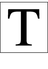 Serif | 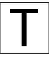 San serif |
Three is pushing it. If the design has a need for a third, and it really does make the design better somehow, then you're fine. Things that might warrant a third font would be a drop cap, page number, something subtle.
Four? That's just crazy talk!
I recently saw a poster advertising an upcoming event for a local charity. The poster had no less than 6 different fonts on it, and it's a jumbled mess. It's difficult to read and there is no flow or sense of balance to it at all. And sadly, it looks amateurish.
Even famed artist Leonardo da Vinci was quoted as saying “Simplicity is the ultimate sophistication,” although I'm sure he said it in Italian. But I'm sure he meant Keep it Simple, Stupid!
 RSS Feed