
I LOVE color. Color is my favorite element of design. There is no other element that can produce an emotional response the way color can. Even as very young children, we picked out colors that we liked best, and wanted to be surrounded by… our clothes, our room, our toys. My daughter, a tween, still surrounds herself in turquoise. She tells me that it's a happy color, and makes her feel calm. She's been saying that since she was 7. Before that, it was pink. Because it made her feel pretty.
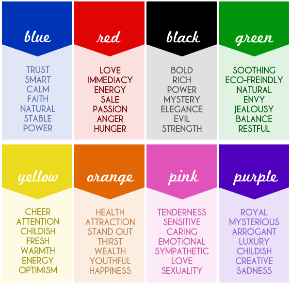
So, when picking a color to use in a design, whether it be for marketing and identity, or a piece of fine art, or a technical illustration, it's important to recognize that color brings out feelings in the viewer, or customer. Alexandra Engelson at the website janinejust.com posted this great graphic that helps break down the most common emotions and meanings associated with colors:
So, when picking a color to use in a design, whether it be for marketing and identity, or a piece of fine art, or a technical illustration, it's important to recognize that color brings out feelings in the viewer, or customer. Alexandra Engelson at the website janinejust.com posted this great graphic that helps break down the most common emotions and meanings associated with colors:
I think it's important to know how most people react to a color when working on a design project. If I have a client that is starting a new business, let's say a counselor or therapist, I would want to know what kind of clients they're treating. Is their area of expertise treating depression? Stress? Eating disorders? Working with kids on the Autism Spectrum? That will make a difference when picking colors. What if the client is starting a cleaning business? I'd want to know if they're doing commercial or residential, if they're using all-natural/organic cleaning supplies or chemicals. When picking colors for all of the Branding, we need to convey the message of what service or product they're selling.
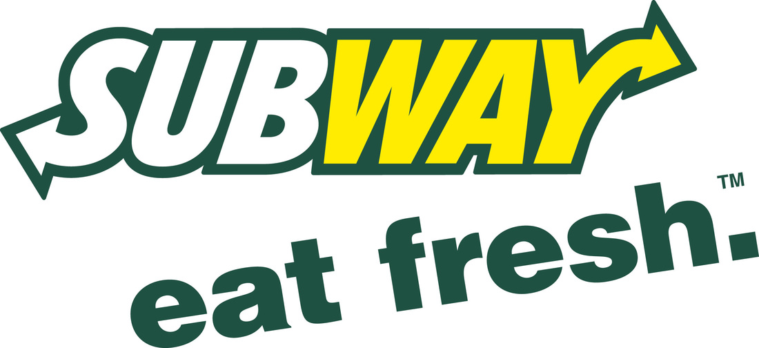
Let's look at a common logo…Subway. And let's look at it without that fresh, healthy green that they use on all of their marketing:
Let's look at a common logo…Subway. And let's look at it without that fresh, healthy green that they use on all of their marketing:
 | 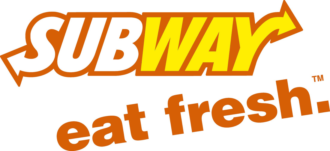 |
The orange version is still a lovely logo, but it certainly doesn't make me think of fresh, healthy ingredients! Eat fresh? Indeed!
What about other uses of color? The color your paint your walls, the color of the petunias in the front porch hanging basket, the sweater you decided to wear to work this morning, all demands an emotional response. As anyone who knows me well, knows that I surround myself in bright or bold colors. My office is a rich purple. My favorite shoes? Bright coral patent leather. I have a trench coat in the same coral. It makes me happy.
Not sure what colors to use? Start with a basic guide like I posted above, and pick the words that seem to best fit what you're trying to convey. Then, try different shades of the colors associated with the words in designing your logo, or swatches on your wall, whichever the case may be. Is the blue more soothing? Or the green? Is the orange exciting enough? Or should you go bold and try the red? How does it make YOU feel? Then, ask people you know and trust for their opinions. How does your choice make THEM feel?
Getting the right color, and therefore the desired emotional response, is key in successful Branding for your business!
 RSS Feed