So friends, today’s lesson is about PMS! And before you think I’ve totally lost it, (or not yet had my morning coffee), I’d like to add that I had NOTHING to do with this acronym.
PMS stands for the Pantone Matching System. The Pantone website describes it as “The Pantone Matching System (PMS) is a proprietary color space used in a variety of industries, primarily printing, though sometimes in the manufacture of colored paint, fabric and plastics.”
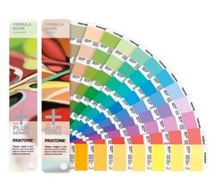
In non-designer speak, it’s a color-matching system, just like we use paper color swatches to match our paint at Lowes so that your living room walls go perfect with the area rug. Designers buy expensive swatch books, and printers have the same expensive swatch books, which includes the official formula to make sure what they print matches what the designer designs.
PMS stands for the Pantone Matching System. The Pantone website describes it as “The Pantone Matching System (PMS) is a proprietary color space used in a variety of industries, primarily printing, though sometimes in the manufacture of colored paint, fabric and plastics.”
In non-designer speak, it’s a color-matching system, just like we use paper color swatches to match our paint at Lowes so that your living room walls go perfect with the area rug. Designers buy expensive swatch books, and printers have the same expensive swatch books, which includes the official formula to make sure what they print matches what the designer designs.
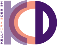
This is a really good thing! So often, color is a big part of a business’ brand. If the designer and the client have worked together to perfect the business identity, chances are they spent a chunk of time deciding on the color scheme. If everything heads to the printer to be made into business cards, stationery, ball-point pens, staff shirts, signage, and stress squeezie balls, those colors should all still be the same.
But guess what? If I didn’t use a PMS color, everything could come back all different colors that are merely close to the correct color. Glossy paper typically prints darker. Newsprint prints much lighter, and all the papers in-between give you all sorts of shades. Plus, some papers and fabrics can reflect the color pigments differently, so that it can appear more yellow or blue or whatever. And stress squeezie balls can be a different color altogether.
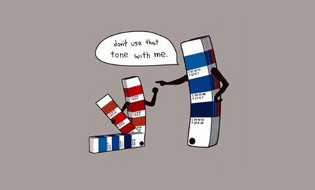
If you don’t specify a PMS color, you have two choices. Your design will either be CMYK or RGB. One or the other. CMYK colors are created with 4 colors: cyan, magenta, yellow and black. They are used in printing. Chances are, if you own a color inkjet printer, you have to buy these colors of ink cartridges. When they’re printed, they get applied in different percentages to make all of the colors of the rainbow. RGB colors are created with 3 colors: red, green and blue. RGB colors are used in web applications. They appear more vibrant on screen than CMYK colors. Problems can arise when the wrong one is used. RGB doesn’t print correctly. CMYK looks dull and flat online. And when web files are copied off a website, or emailed by mistake, to be used in printing, you’ll get something that doesn’t even look close to what you were expecting…when a RGB color is converted to CYMK, it’s close but no cigar. This doesn’t happen with PMS colors.
Do you ALWAYS need to use PMS colors? No.
If you have a small batch of printing, and it’s just one item, and the colors look fine when you check the proof, no. And here’s why. Printing in PMS is more expensive. When I send a print job in CMYK to a print shop, it gets sent through the press and comes out how it comes out. No adjustment is made by the print shop. When I send a job through in PMS color, the printer has to custom mix the inks according to the Pantone formula to insure that the color is correct. More labor intensive = more money. But it’ll look good!
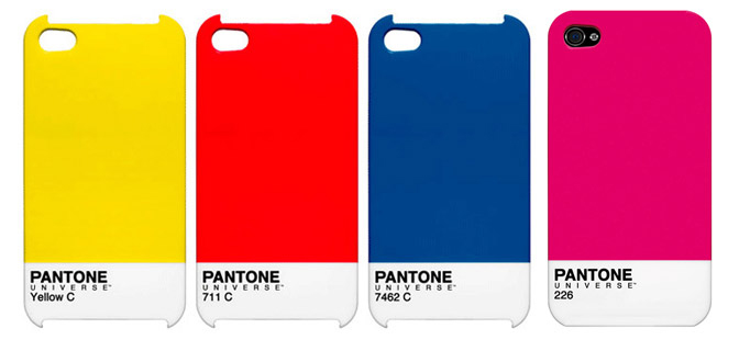
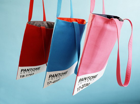
On a more frivolous note, Pantone has a whole line of fun gift items based on PMS. They offer all sorts of useful items, iPhone cases, coffee mugs, T-shirts, mouse pads…perfect for your favorite designer! In case you were looking for that perfect Christmas gift. (hint)
But guess what? If I didn’t use a PMS color, everything could come back all different colors that are merely close to the correct color. Glossy paper typically prints darker. Newsprint prints much lighter, and all the papers in-between give you all sorts of shades. Plus, some papers and fabrics can reflect the color pigments differently, so that it can appear more yellow or blue or whatever. And stress squeezie balls can be a different color altogether.
If you don’t specify a PMS color, you have two choices. Your design will either be CMYK or RGB. One or the other. CMYK colors are created with 4 colors: cyan, magenta, yellow and black. They are used in printing. Chances are, if you own a color inkjet printer, you have to buy these colors of ink cartridges. When they’re printed, they get applied in different percentages to make all of the colors of the rainbow. RGB colors are created with 3 colors: red, green and blue. RGB colors are used in web applications. They appear more vibrant on screen than CMYK colors. Problems can arise when the wrong one is used. RGB doesn’t print correctly. CMYK looks dull and flat online. And when web files are copied off a website, or emailed by mistake, to be used in printing, you’ll get something that doesn’t even look close to what you were expecting…when a RGB color is converted to CYMK, it’s close but no cigar. This doesn’t happen with PMS colors.
Do you ALWAYS need to use PMS colors? No.
If you have a small batch of printing, and it’s just one item, and the colors look fine when you check the proof, no. And here’s why. Printing in PMS is more expensive. When I send a print job in CMYK to a print shop, it gets sent through the press and comes out how it comes out. No adjustment is made by the print shop. When I send a job through in PMS color, the printer has to custom mix the inks according to the Pantone formula to insure that the color is correct. More labor intensive = more money. But it’ll look good!
On a more frivolous note, Pantone has a whole line of fun gift items based on PMS. They offer all sorts of useful items, iPhone cases, coffee mugs, T-shirts, mouse pads…perfect for your favorite designer! In case you were looking for that perfect Christmas gift. (hint)

 RSS Feed