
I was looking up information about fonts the other day, and came across a humorous article called 23 Really Bad Font Choices (http://bonfx.com/bad-typography). It was written back in 2009, but it was still funny. To prove their point about picking the right font for the job, they intentionally designed logos with the WRONG font. It's worth checking out!
So that brings me to today's Blog entry...picking the right (and not the wrong) font. There IS a right or wrong font when talking about design, especially when designing logos. But there isn't always ONE right or wrong answer.
What makes a font right or wrong, you might ask. Even though I can tell when looking AT a logo or marketing materials for a company, if their font is the right one or not, it's a little tricky putting it into words. But really, it just feels right. Fonts have a personality. They can be strong, soft, funny, elegant, or even comforting. The key is to pair the font with the feeling you want your art to have. Sports Bar? Go with strong and fun. Wedding invitations? Probably elegant. Art Gallery? Something creative or unique.
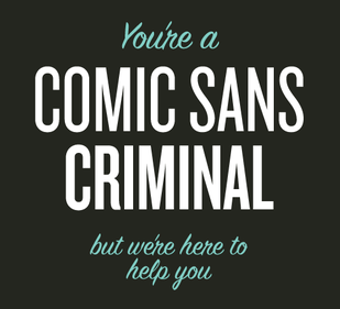
Here I've taken some very common logos that we see every day and replaced the font with something wrong.
So that brings me to today's Blog entry...picking the right (and not the wrong) font. There IS a right or wrong font when talking about design, especially when designing logos. But there isn't always ONE right or wrong answer.
What makes a font right or wrong, you might ask. Even though I can tell when looking AT a logo or marketing materials for a company, if their font is the right one or not, it's a little tricky putting it into words. But really, it just feels right. Fonts have a personality. They can be strong, soft, funny, elegant, or even comforting. The key is to pair the font with the feeling you want your art to have. Sports Bar? Go with strong and fun. Wedding invitations? Probably elegant. Art Gallery? Something creative or unique.
Here I've taken some very common logos that we see every day and replaced the font with something wrong.
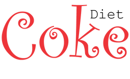 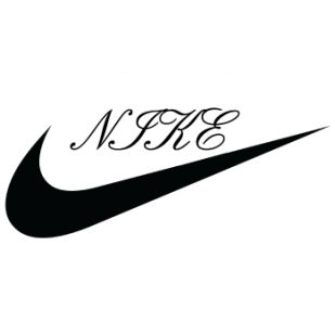 |  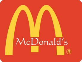 |
Can you see how wrong these look? Not just because they're different that how you normally see them, but also because the style and weight and personality of the font is just wrong.
The Nike one brings up another point about fonts...the rules. In addition to there being right and wrong fonts, there are rules as to how to use the fonts you pick.
The Nike one brings up another point about fonts...the rules. In addition to there being right and wrong fonts, there are rules as to how to use the fonts you pick.
- Never, ever, using all capital letters in a script font. Never. It looks awful and is nearly impossible to read.
- Don't mix too many fonts together and be careful what you mix! Many times, just one or two fonts work great in a design. A third can be added if you really, really feel that you need it. But please stop there. And know that the second or third font is just as important in the overall design as the first, and it needs to compliment the first one. Also, the main font, the first one, the big one at the top, it can be fancy or curly or whatever. But that doesn't give you grounds to repeat it anywhere else. Find something simple and stick with it.
- Don't make uppercase letters into small caps. If you want to have your text in small caps, use a font that has that as an option. Otherwise any capital letters will be out of scale with the rest of the text and look stupid.
- Don't stretch and shrink fonts so that they aren't at 100% both vertically and horizontally. If you want the text to stretch out longer to fill the space, pick a font that looks like that from the get-go.

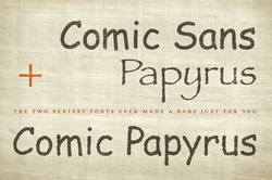
There are many designers who claim that there are fonts you should never, ever use. Some of the more common ones are Comic Sans, Papyrus, Hobo, Curlz, Courier and Bradley Hand. I have a hard time adding these to my list of "rules". Despite the fact that they are not professional looking or overused, I can't BAN them. I would however, caution you to be very careful if you decide to use these, since they are nearly always the WRONG font. When Papyrus was first created back in the early 1980s by designer Chris Costello, it was a really nifty classic font. But once it was included in many standard software packages and operating systems, it became so overused that it has become tacky. The only place that it's really suitable is a church flyer. Comic Sans has been around a while too, since the mid 1990s. It was created for use on informal documents and educational materials. But again, since being included in Microsoft Office, Comic Sans gets used for all sorts of design that it was never intended for. A quick way to make your image look unprofessional...use Comic Sans in pretty much anything.
Inspirational quote to end on:
“Typography is the use of type to advocate, communicate, celebrate, educate, elaborate, illuminate, and disseminate. Along the way, the words and pages become art.”
― James Felici, The Complete Manual of Typography
Cheers - Kelly
Inspirational quote to end on:
“Typography is the use of type to advocate, communicate, celebrate, educate, elaborate, illuminate, and disseminate. Along the way, the words and pages become art.”
― James Felici, The Complete Manual of Typography
Cheers - Kelly
 RSS Feed